News India Live, Digital Desk: Google Logo Change 2025: Have you noticed that Google, the world’s largest tech company, has refreshed its logo after 10 years? The company has changed people after almost a decade, now you people will see Google’s logo in new color and now the G icon has become more colorful than before. Google’s new logo is seen in iOS and Android beta version 16.8.
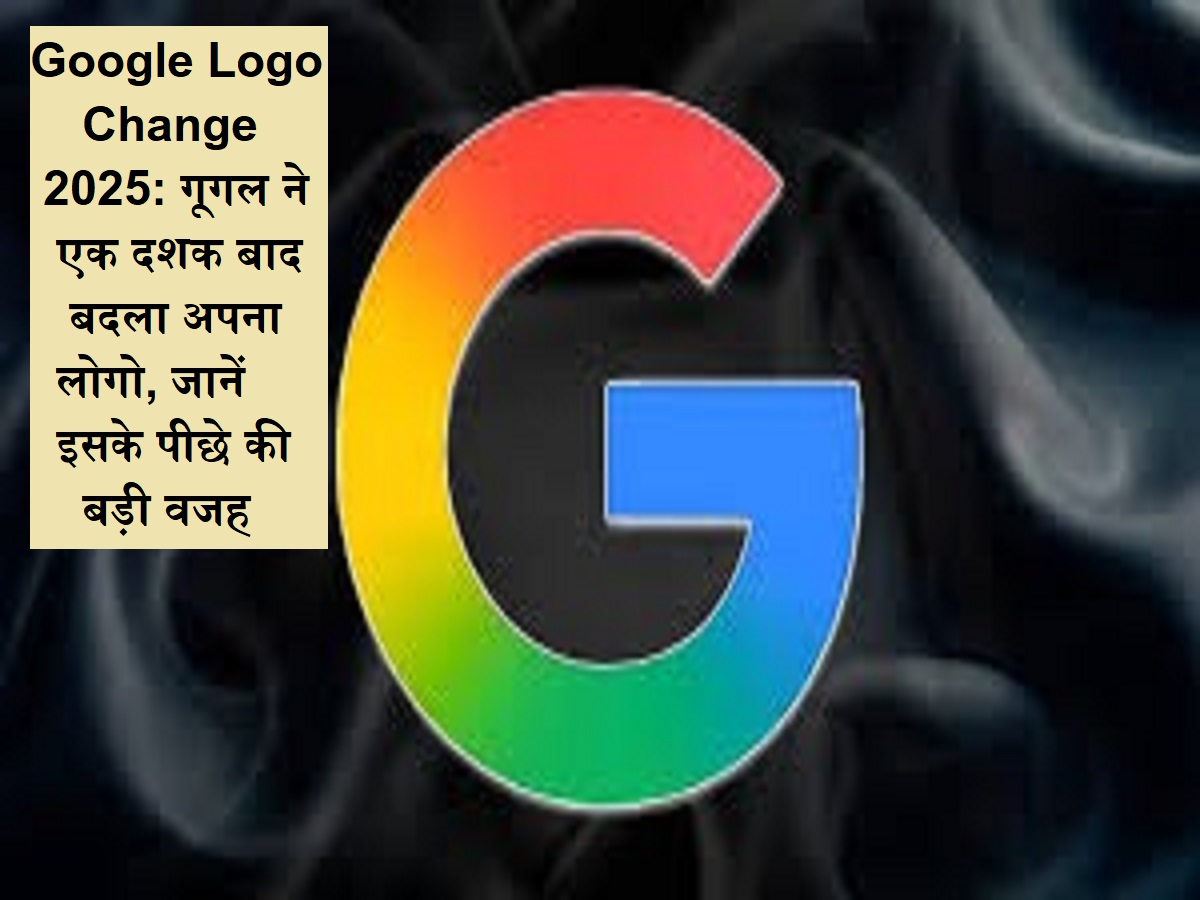
In the old G icon, red, blue, green and yellow four different colored blocks were seen, the same four colors are there in new people but now you will not see blocks. With this, you will see a new logo gradient in design and dynamic look.
This may be the reason for changing G Logo
What is the purpose behind changing Google’s logo, it is not clear, but it is indicating that the company is rapidly increasing its focus on AI. According to media reports, Google’s other services such as Gmail and Google Maps do not see a new G icon at the moment.
Currently, no official information about the new update has been revealed by Google, but this update has come just before the Google I/O 2025 event to be held on May 20. It is expected that more information about the new people of the company can be given in the event.
According to the 9 to 5 Google report, Apple users have started seeing new people through Google search app, but currently new people have been spotted in the beta version 16.8 of Android. The new logo can be seen on the pixel smartphone and selected iOS device, the same non -pixel Android smartphones and the old G people will be seen on the web.
Fruit Peel: Do not use fruit peels useless, the benefits of amazing are hidden in peels from pomegranate to papaya